Wednesday, May 30, 2007

Full-page Inking Timelapse


It's been a while since we last updated this blog. Anyway...this is a timelapse of inking that I did, I compressed this 12 hour inking to eight minutes timelapse. Enjoy watching. :)

Tuesday, August 15, 2006

Comic Book Inking Video


This is a five-minute video of me inking a comic book page using a quill and India ink. Artwork was drawn by Bing Cansino printed in 11"x17" Marvel paper artboard.

Wednesday, May 31, 2006

We'll Take Care Of It

Cable/Deadpool #26, panel 1.


I was asked to ink Lan Medina's Cable/Deadpool cross-overs, from issues 25-27. It was fun, and I enjoyed inking Lan's pencils. Although there were times we were getting late, which I don't like since I am starting again as an Inker. My boss asked me to do a tryout last year. I told them I am much comfortable inking Lan's work as I enjoy colouring his pages. Anyway, I was asked if I could embellish his work, I told them I could do that, but that depends if I have much time to enhance the panels. This kept in my head and I want to do what my boss told me. So I was given three issues of Cable/Deadpool to ink. I was excited.

So we were couple or five days late, so Lan was bashing all the pages. He was quick and I was slow. I was trying to cope but what was keeping me slow is trying to embelish his work. If I do that, I'll be more late! So one should be sacrificed.

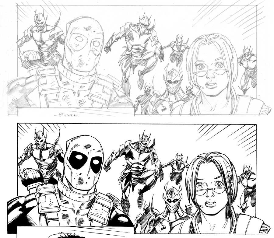
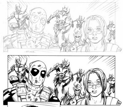
Above image was one panel on the page we did on Cable/Deadpool #26. Lan really rushed the page and it was all in my hand to enhance it. Well, I tried but time was running out.

I was thinking if these pages were digitally inked (or darkened to look like it was inked)? Would they come up with better result?

Wednesday, November 16, 2005

Think Before You Ink Part 1 0f 9


THE PENCILS

When you’re starting off, or relatively new to inking, it helps to break things down step by step into a methodical approach. There is no “right way” or “wrong way” to do this, but I’ll show you what works for me and maybe it’ll help you in your approach. I’ll use the recent cover of Hunter Killer #9 as an example of a more methodical approach to inking. I’ve been inking so long, I’ll usually skip around on the pencils and ink whatever I feel like, but for this example, I’ll try to ink in clear steps and show you the thinking behind them. The goal here is to “think before you ink” and ask yourself how you are going to approach it and why. Every line you put down should mean something and have a purpose. Ask yourself what is the penciler is trying to accomplish and how can you collaborate with him to achieve that goal?

The first step is to look at the pencils. Are they tight or loose? How do you want to approach them? What will you need to add or embellish? In this case, the penciler Eric Balsadua is pretty tight and comes from the Marc Silvestri school of penciling. So my usual Top Cow style of inking should be the way to go. Lots of rendering and energetic line work. All the information is there, not much too add, but I’ll tighten things up as I go. A tip for beginning inkers, if you’ve never worked with the penciler before, now would be a good time to call him with any questions or just to introduce yourself and see what he’s looking for in the finished product. Also, if you need character reference, ask your editor. It’s a great way to get free comics delivered to your door!

Think Before You Ink Part 2 0f 9


SPOTTING BLACKS

I’m going to use a Hunts #102 nib for almost all of my inking on this cover and Pelikan Type A Ink. I start off by spotting the large black areas and outlining them. I place X’s inside so I know to fill them in with solid black ink later.

TEMPLATE WORK

Next, I get all the template and ruler work out of the way. I ink the 35 degree ovals for the signatures, and the circle under her lip using templates and a Pigma Micron 01 pen. These marker type pens are perfect for use with a template since they don’t bleed ink under the lip of the plastic onto the page. Then I pick up my nib and a small triangle with beveled inking edges to ink the crosshatching (the burlap texture in the background and the speed lines above Wolf (the biggest character at the top). There’s a trick to even this simple texture, make sure the lines get fatter and close up to fade into the black areas. If you do it right, it will create a cool effect. If you don’t it will look like tiny tic tac toe grids!

Think Before You Ink Part 3 0f 9


INKING OUTLINES

I ink the outline of each character first. There’s a few reasons for this:
1. You always start with the biggest most basic shapes and work down to the tiniest details last. Your drawing and inking will be much more solid that way.
2. I can start to see how my line weights are working in relation to each other. Do I need to thicken up any lines? Where is my light source coming from? If the penciler has not defined a clear light source, assume a top down light source. Things like that all come into play.
3. I’ve now divided this big giant 11x 17 cover into four smaller figures. Start big and always refine as you go. If the piece isn’t beginning to work at this stage, all the detail and rendering I add will not save it, but make it worse.

Think Before You Ink Part 4 0f 9


FIGURE WORK PART 1

I’ll start with the woman in the lower left corner, Samantha Argent, since she’s small and easy to ink. That will warm me up for the rest of the piece. Also, if you have a new nib fresh out of the box, it helps to break it in. It will loosen up and become more flexible as you go.

I use the same approach on each figure. I ink the biggest contour lines first on the gun, outlining the eye, the lips, chin, etc. Only when all my contour lines are inked do I begin to feather and do gradations. I check my line weights as I go and if I don’t like a line, I sculpt it by going over it again. For some reason, I always do the hair last. Probably because now the nib and my hand are warmed up and I can throw long sweeping lines with confidence. I ink the hair the same way, thick black areas and lines first, thin detail lines last. You’ll get into a rhythm and have fun with it.

Every line you put down should mean something, don’t put down lines if you don’t know what they mean. Notice I implied some circuitry and tech in the gun. Notice the seams on the fingers of her glove.

Think Before You Ink Part 5 0f 9


FIGURE WORK PART 2

Next I inked the guy in the suit. Morningstar, I think his name is. All freehand with a 102 nib, except for the gradations which I used a french curve on. The buttons on his suit are freehand as well. Another tip: if the penciler uses a template, you should too. But if he’s drawn circles freehand, you should ink them freehand. It just looks more organic and fits the style better.

Again, I use the same approach on each figure. I ink the biggest contour lines first , then feathering and gradations, hair last. A hair dryer comes in handy to quick dry areas of wet ink as you go. Other people like to work on two or three pages at once so they can switch pages as another page is drying. I like to focus on one page at a time unless I’m in a mad deadline rush.

Think Before You Ink Part 6 0f 9


FIGURE WORK PART 3

Now I move onto the central guy, Ellis, same approach. His left arm was fun to ink with all the organic bio tech or whatever it is. The transformation is ripping his costume as well. Notice that I clean and test my nib in the X areas since they will be filled in solid black later. I also keep a blotter and a rag on my desk to wipe off excess ink as I work. If you ink gets too thick, you can thin it with water as needed.

Think Before You Ink Part 7 0f 9


FIGURE WORK PART 4

Next I move onto Wolf, the biggest figure. Same approach as the first three figures. I did the fine stubble of his day old beard growth last. Here it is right before I inked his hair. By this point, not only am I fired up, but my nib is broken in an flexible, so I can throw those long lines of hair.